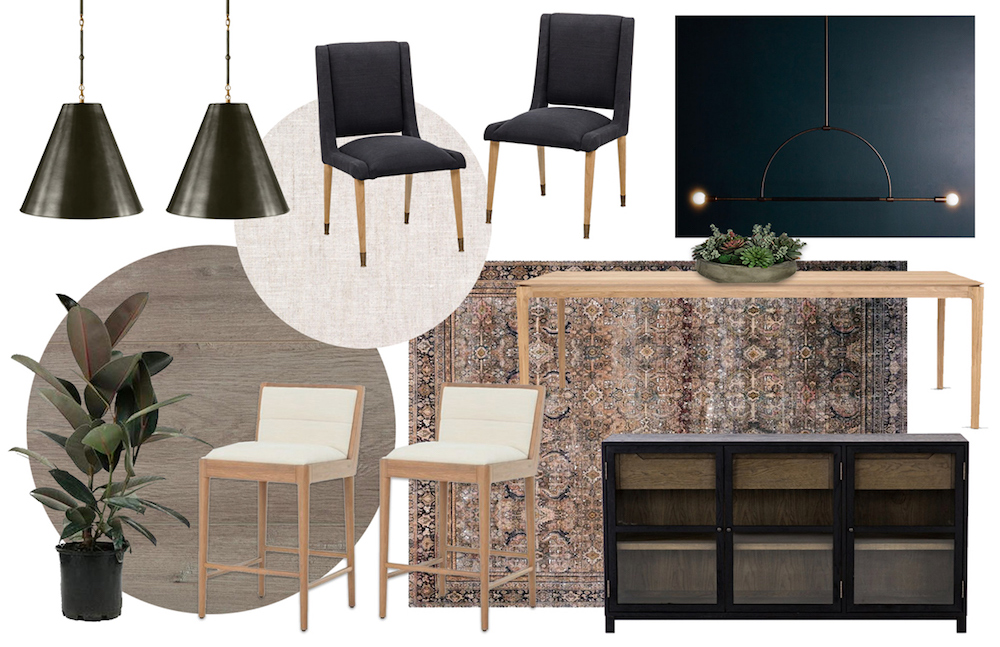
I’ve been putting this post off for months because, quite frankly, the dining room has taken me forever! And it’s still not done!
But I know several of you said you like the see progress images and want to hear about the process, so I definitely wanted to honor those requests. It’s hard for me to share things without them being *DONE* but I’m working on getting better at that! I’ll do my best to explain all my decisions and what we have to do!
For starters, I’m not really sure you could call it a dining “room” since it’s technically just a little area set off the kitchen. It’s more like a dining “area” to be more specific. One thing to note about this area is that it’s right next to the kitchen so it kind of needs to coordinate with the backsplash and grey cabinets in there.
Choosing The Dining Room Table
I started with the dining table because I felt like that would dictate the rest of the room. When we viewed the house while it was on the market, it was staged with a black table and I knew I didn’t love that look. I wanted something warm-toned to create a more cozy vibe. I’ve shared this with y’all before but I’ve never been a big fan of the grey floors, so I actually approached every room with an intention to warm it up in whatever way I could. If you’re wondering why we didn’t just re-stain the floors, I talked about it in this original blog post but basically it wasn’t possible without replacing ALL the floors. And since this isn’t our forever home, we decided to keep them and make the most of it!
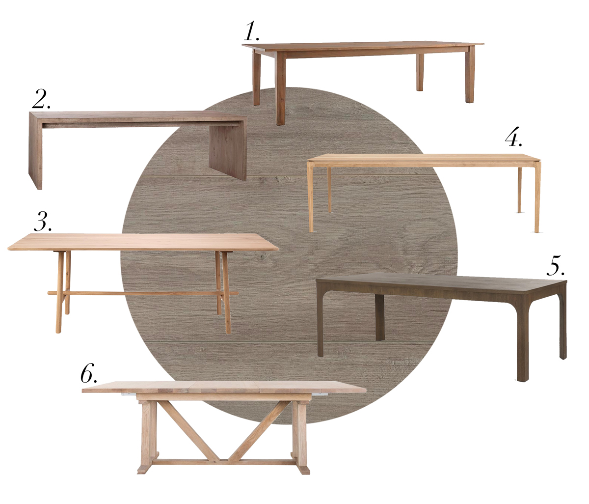
Back to the table and how I made that decision. Bridgid, our designer, helped pick out a few lighter-toned tables to look at. We ordered samples of all the wood to see how it would mesh with the floors. We ended up going with a really light-toned wood table that has just the right amount of warmth without being too yellow (yellow tones looked terrible with the floors!)
After looking through the options and thinking on it, I decided I wanted something with simple legs because I don’t like hitting my knees or feet on anything under the table – I’m weird about that. So that ruled out options 6 and 3; even though I loved how those tables look – I knew I’d be happier with a cleaner design! I also tend to gravitate towards tables with a really thin top to them.
After *much* thought, I finally bit the bullet and went with what my gut was telling me, which was option 4! And I couldn’t be more happy with it – I LOVE the color and simple shape!
The Sideboard + Styling
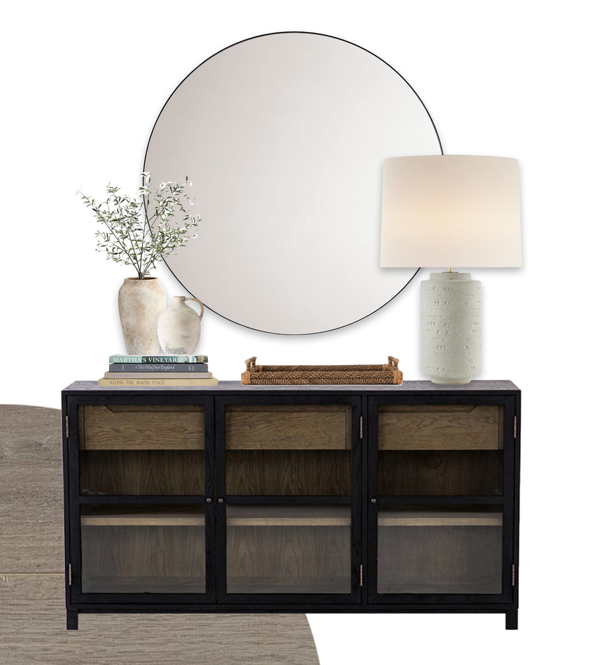
After the table, the next thing we decided on was the storage cabinet. I knew I needed something I could put all our non-daily glassware and stuff in because we needed the extra storage. We loved the two-toned look of this one shown in the image above! I highly recommend something like this if y’all are struggling with storage, too. It’s not something I would have thought of right away but it has come in handy for sure!
I’m still working on styling this area above the sideboard, but I know we’re for sure putting this round mirror there. I love the contrast of the perfect round mirror over the rectangular piece of furniture. I’m excited to get some branches, vases, and possibly a lamp to complete the look! The image above is just an idea of what I’m thinking, but I’m still on the hunt for the perfect pieces!
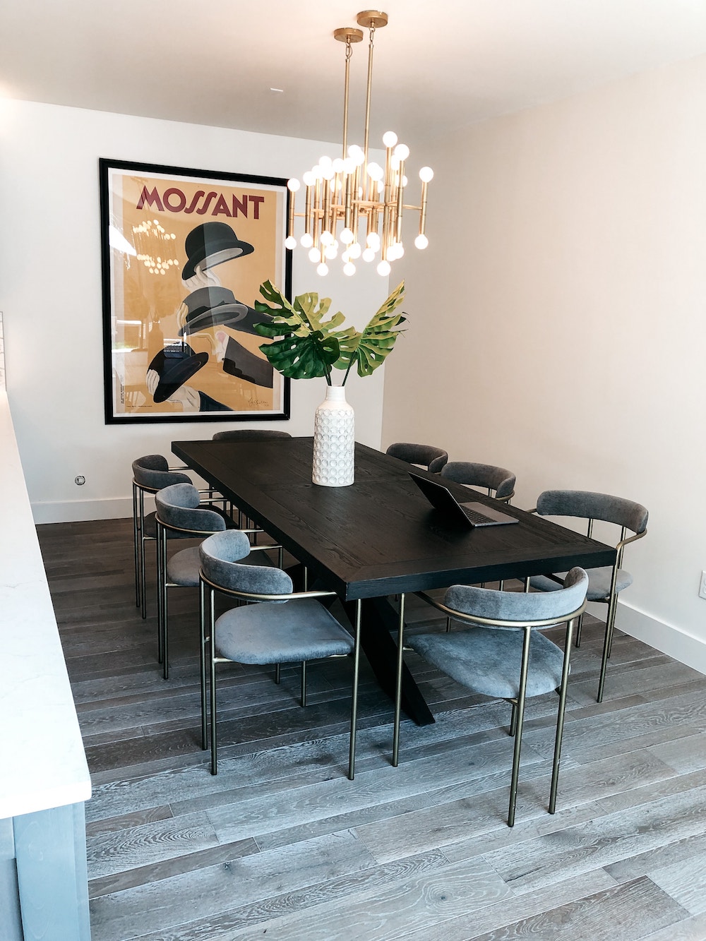
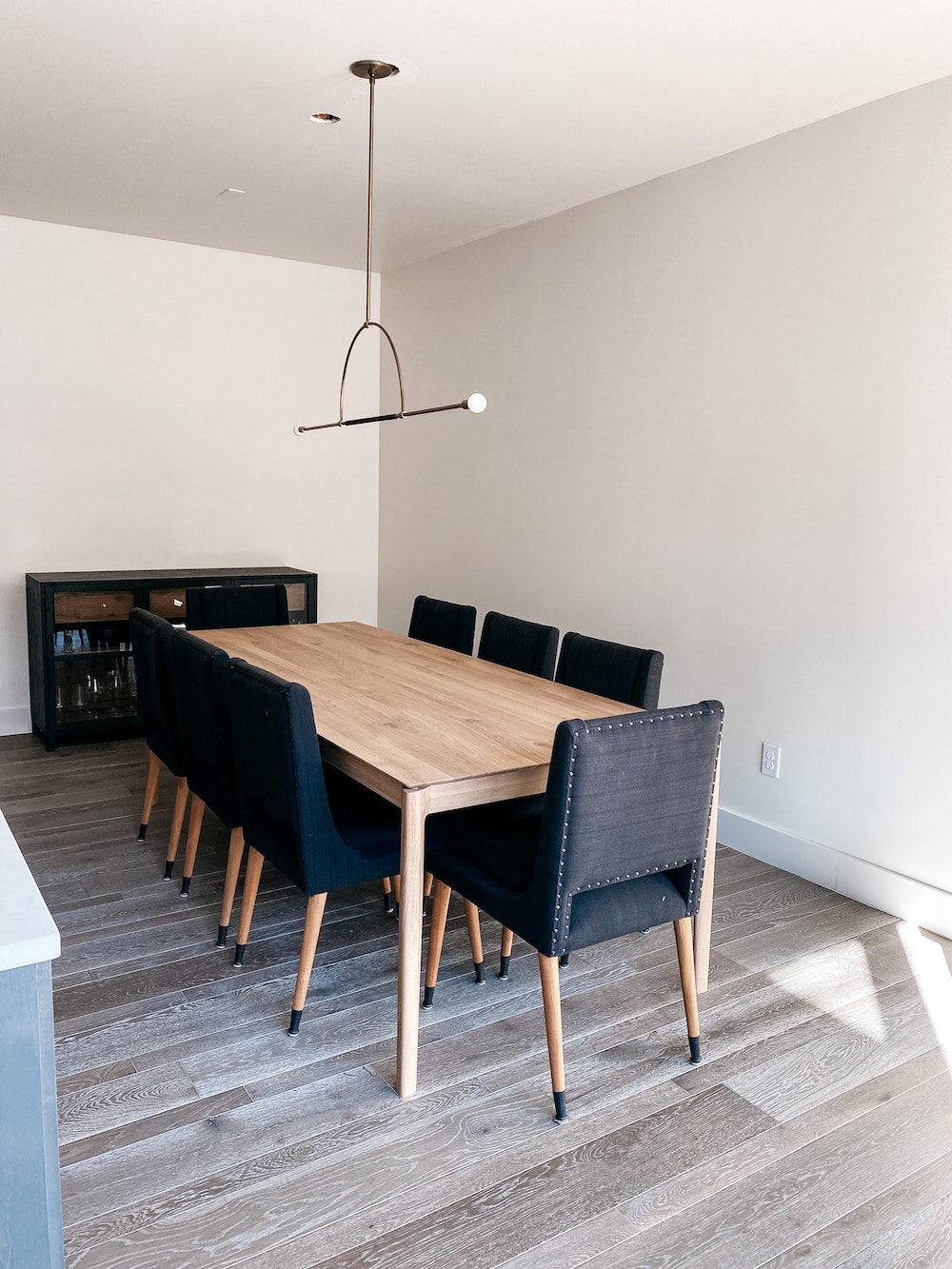
This is a photo (above) of the dining room when we were touring the house – that’s the staging furniture they used to sell the home. But I’m sharing this photo to share the previous light fixture. Plus you can see how the black table makes the room a little more cold and dark rather than warming it up (which is what I wanted to do!).
Switching The Light Fixture
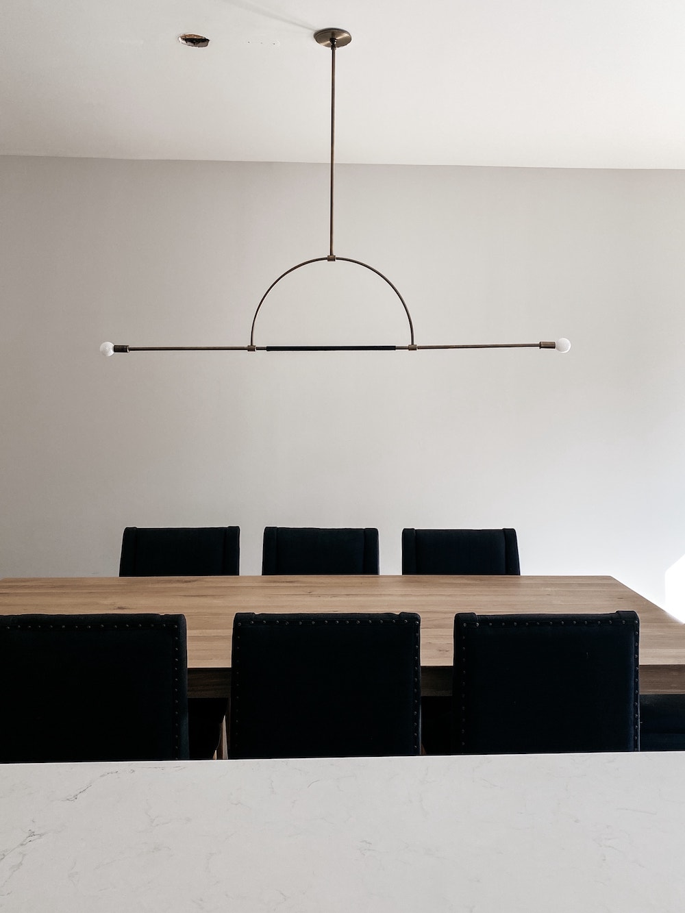
I knew from the moment we moved in that I wanted to switch out the light fixtures. I like some of Jonathan Adler’s stuff, but I wasn’t digging that gold light in this space – just not my style. So after the dining table and sideboard, we chose the light fixture after seeing a few Bridgid suggested.
We got it installed last week and I’m obsessed with its simplicity and I feel like it doesn’t compete with the kitchen pendants. I’m happy we waited (even though I was being impatient) to order the light fixture to AFTER we got the dining table because some of my initial thoughts wouldn’t have flown well together. I’d also recommend thinking about the type of light/brightness you want in a dining room. Probably not something that’s super bright like you would in an office or whatever.
We clearly still need to get the drywall patched since the previous light fixture required two holes. But I’m loving the simplify of this one by Katy Skelton.
The Dining Room Chairs
I was between SO many different chairs for the dining room. I was wrestling with wanting the chairs to look good but also be really comfortable. And a lot of the chairs that looked the best also looked like the most uncomfortable chairs ever! 
At first, I couldn’t decide if I wanted black or a lighter color but then ultimately decided I wanted the contrast of a light table with dark chairs.
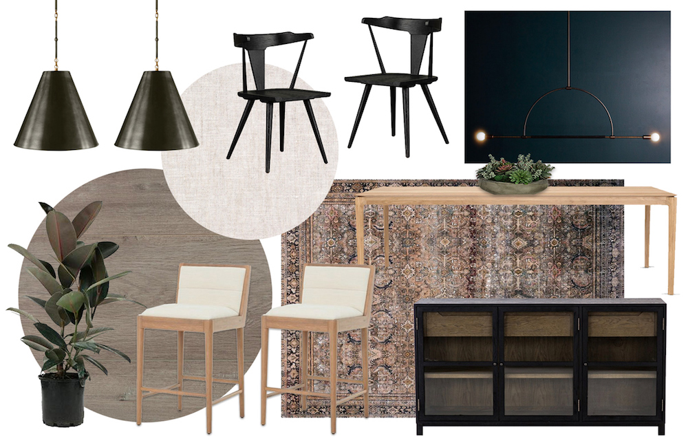
And I loved the way these (above) looked but I KNEW they would be super uncomfortable since they’re just wood! We went through a few other options too and it took me forever to decide but ultimately I got there!

I went with these black upholstered chairs that looked comfortable, cute, and contrasted with the table – they met all my requirements! We’ve since gotten them in and I think they were a GREAT decision – LOVE.
Choosing a Dining Room Rug
I totally thought I was going to love the rug in the mood boards but when it came in and we laid it out in the dining room, it was definitely a NO! The colors just didn’t work.
Plus, the dining room is such a skinny little nook that we’d have to cut the rug thinner and the pattern doesn’t really allow for that of this rug. So we’re still on the hunt to find something else to fit this space. And whatever we do get, I bet we’ll have to get it cut to fit these custom dimensions! Let me know if y’all have any you think would work well.
Next Steps
The next things on my list are fixing the drywall above the light fixture, finding a rug I love and styling the side table. I cannot wait for it all to be done and cute and looking put together! Oh and then I’ll need to find artwork for the right side wall behind the table – I’m thinking something really big and statement-worthy?! What do y’all think?
Shop My Dining Room So Far:

