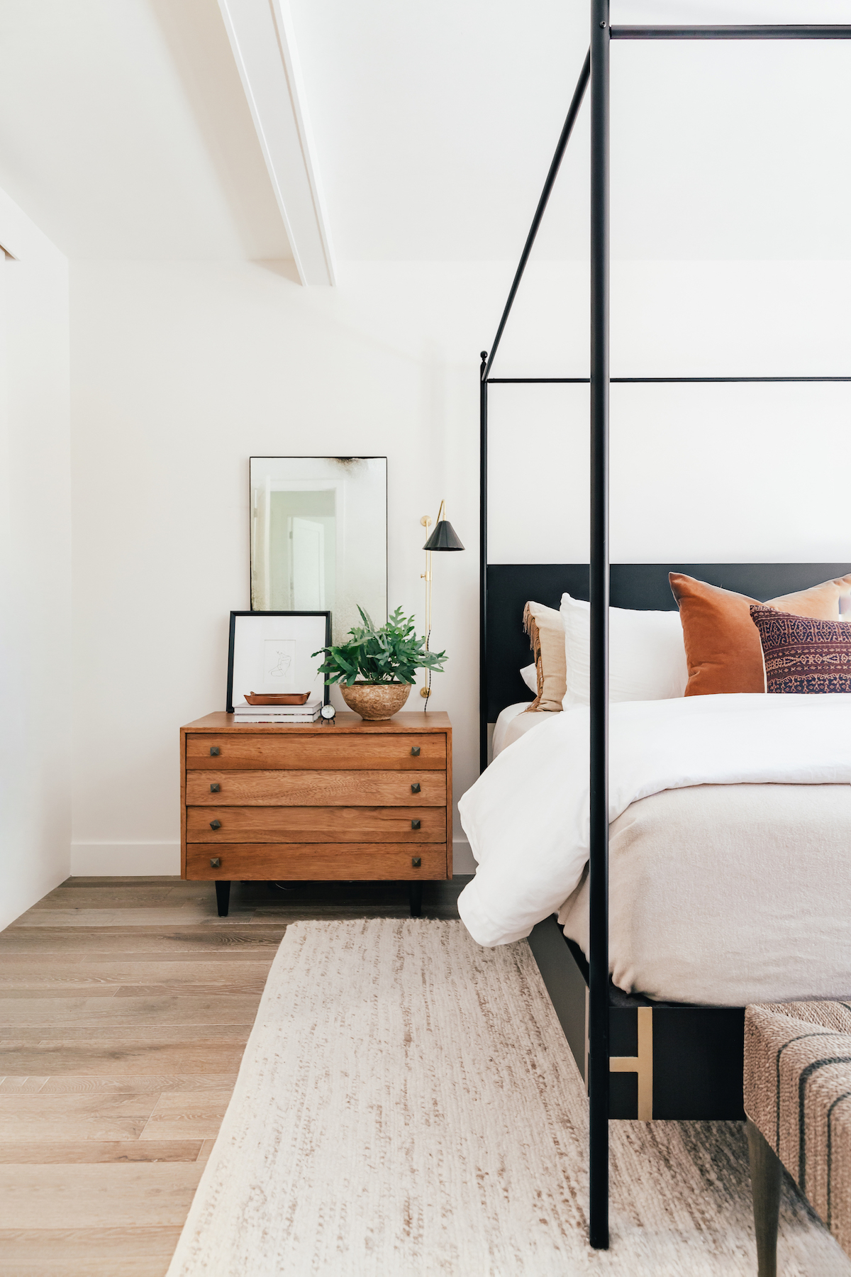
Hi friends! I’m *so* excited to finally be sharing the finished product of our bedroom here in Denver! We moved here in October 2019 and have been slowly but surely decorating over the past year. Things were a little slow to start because I was also planning a wedding (and the holidays!)….oh, and then the pandemic slowed things down FOR SURE. But I am THRILLED to be sharing everything with ya’ll today!
About a year or so ago, I shared what I wanted the aesthetic to be for our Denver home and it’s so cool to go back and read that post and then see where we are now. At the time I wrote that post, I think I only the bed and everything else felt so bare. It feels so good to see it all come together and we couldn’t love this room more!
I wanted to decorate in a way that worked with the grey floors (which I’ve never liked), but that warmed the room up so you didn’t notice the grey as much. I’ve shared this many times, but I just do not like grey when it comes to flooring or walls in a home – I like things to be really WARM. Anyway, we added beams to the ceiling for a little texture and I personally think that made big difference in making the room feel less like a white box.
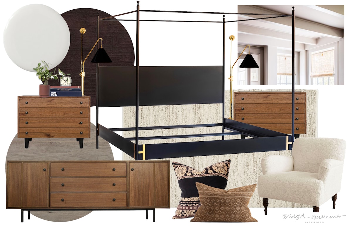
Oh and also, I thought it would be fun to share the mood board we started with so you can see how it came alive! My designer Bridgid Williams put this together for me!
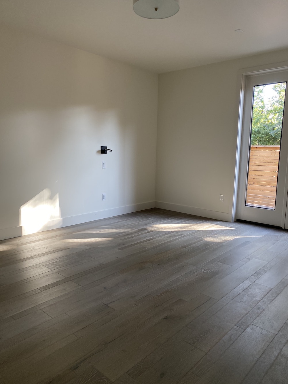
and then just for fun, here’s what the room looked like when we moved in:
and then this time last year, it looked like this:
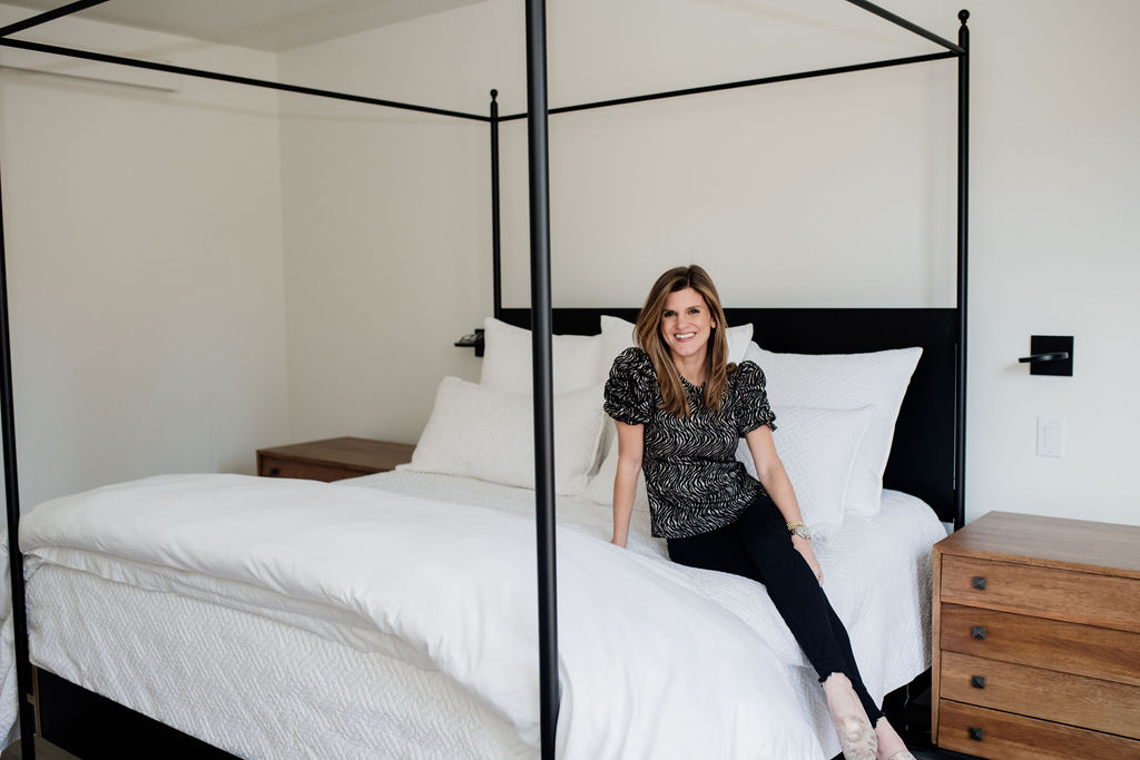
So it has come a long way and we are so excited! in the image above, we had no rug and hadn’t installed the beams! We also painted the walls but you can’t really tell because it’s such a light color.
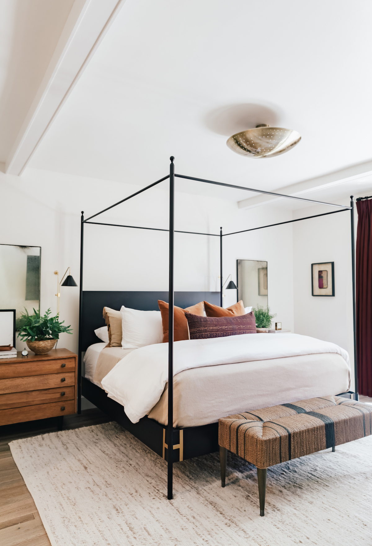
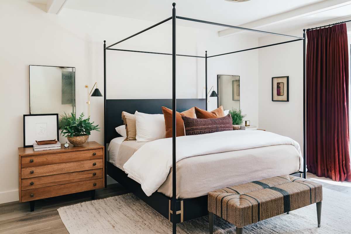
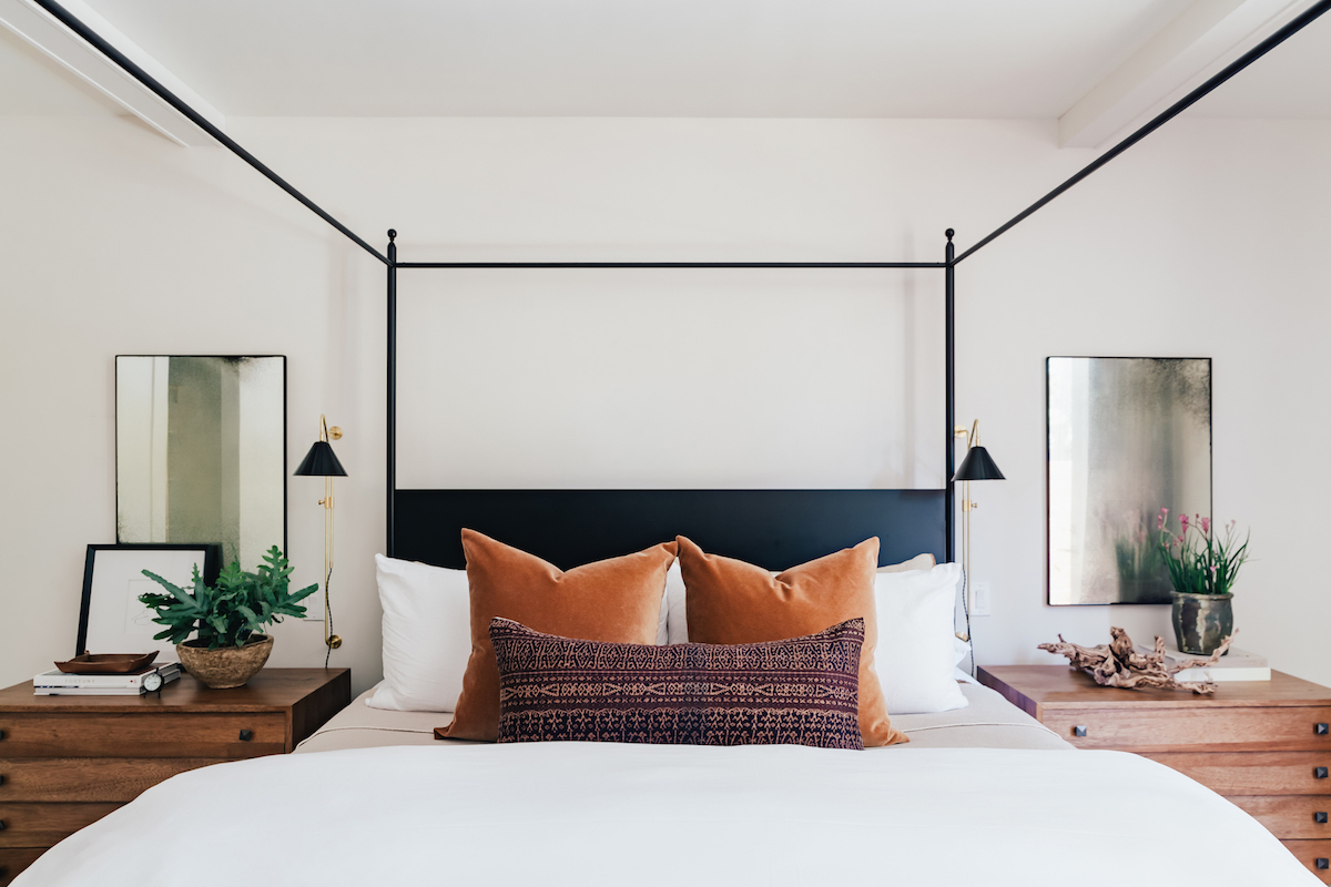
I wanted a layered look for our bed that felt inviting and was comfortable but still looked pulled together. I did all white in my last home and I was kind of over that look. I wanted to incorporate different textures and colors and was hoping for more of a moody vibe. I love how it turned out!
Bed & Bedding Sources:
Bed: Doorman Designs (similar here and here)
Bench at Food of Bed: Palacek Frankie Bench
Printed pillow: vintage/custom
Rust Pillows: custom (similar here and here)
Duvet Cover: I have two. I have the West Elm Linen Duvet and then also the Boll & Branch signature hemmed duvet set
Duvet Insert: Boll & Branch (LOVE!)
Sheets: Boll & Branch
Wool Blanket: Vintage (similar here and here)
Ceiling light fixture: sold out (similar here)
Drapes & Drapery Rod: custom but similar drapery rod found here
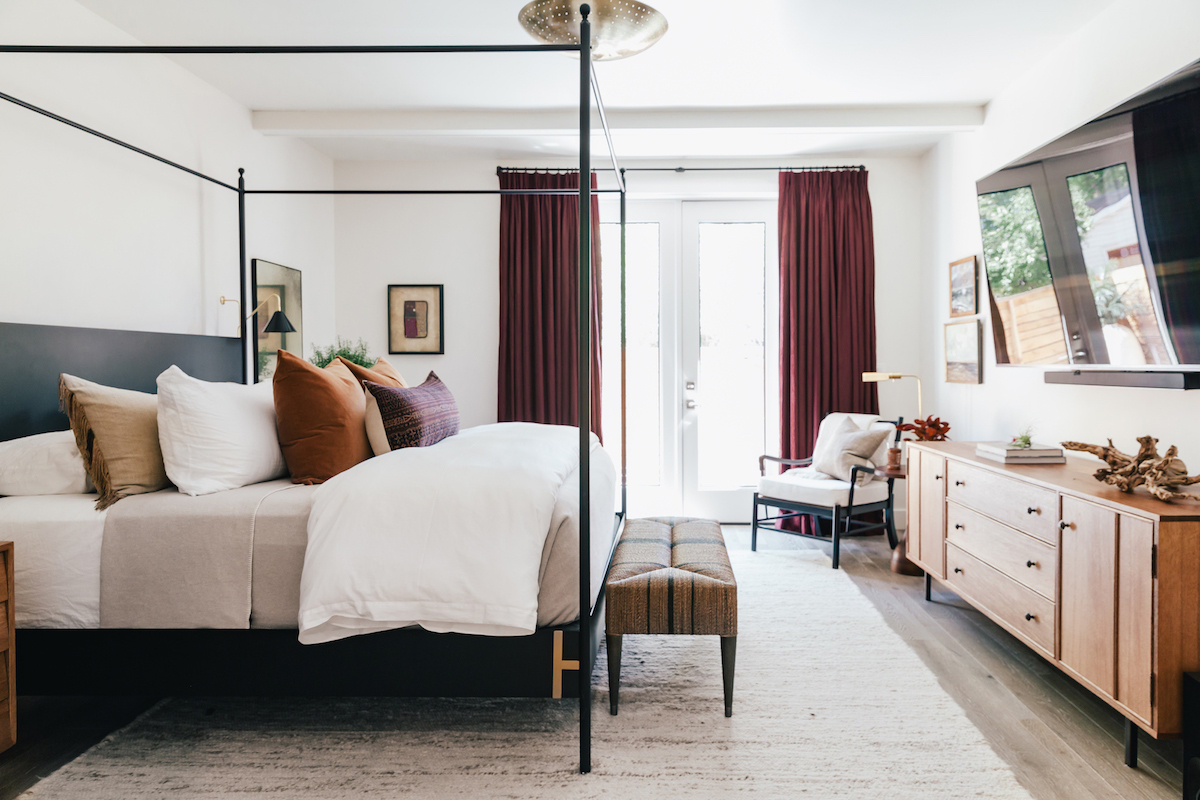
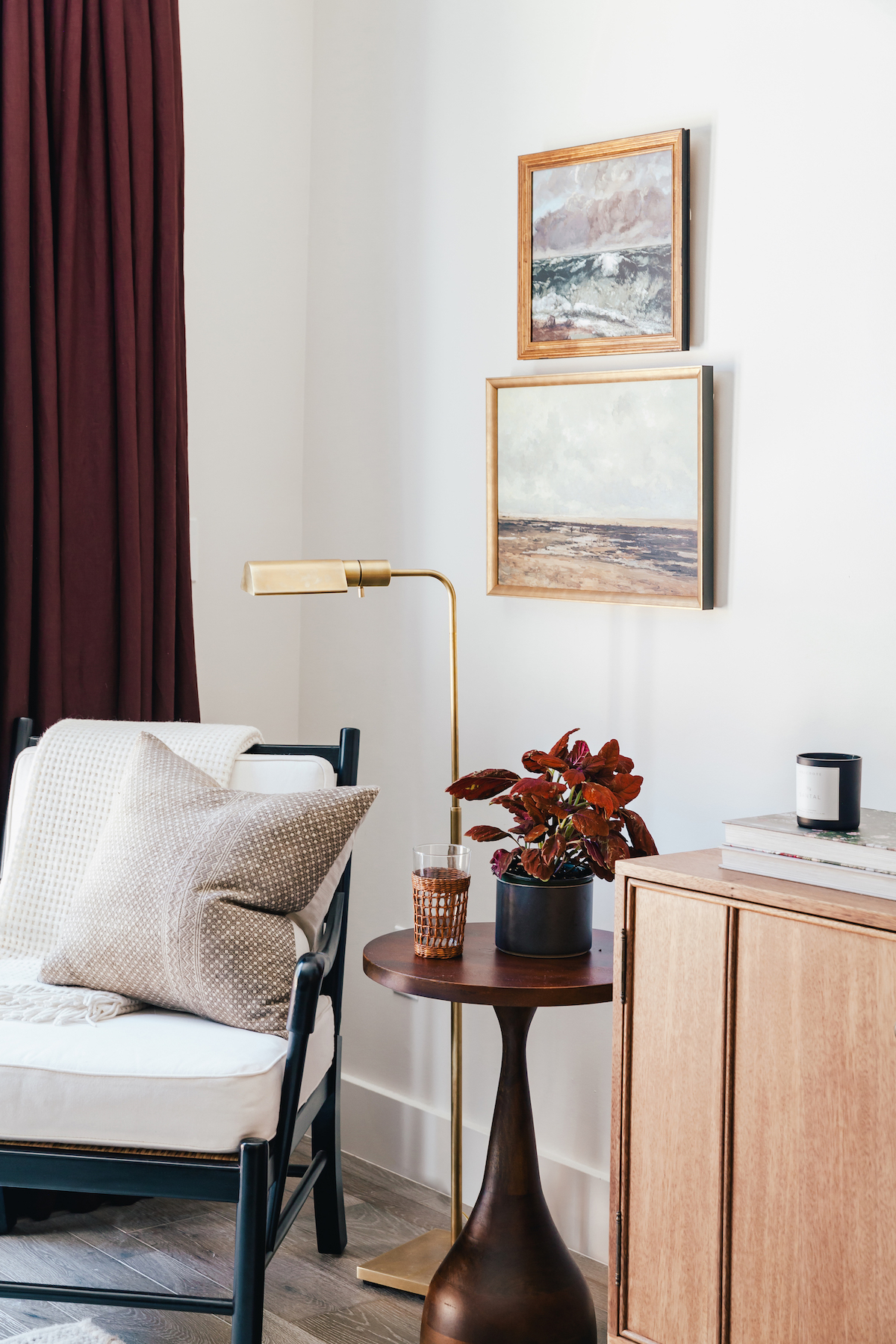
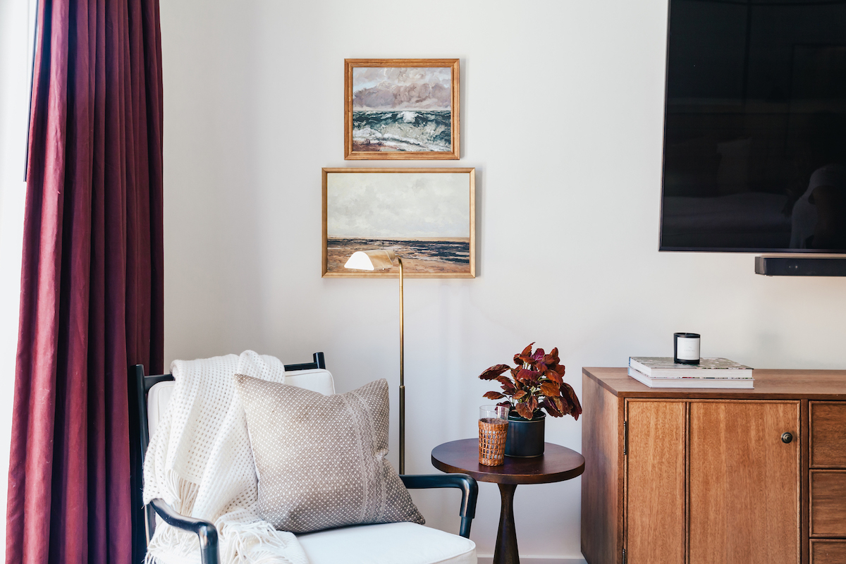
Corner Nook Sources:
Accent Chair:
Gold Lamp: Serena & Lily (less expensive version here)
Side Table: Arteriors
Pillow: vintage
Throw: not available (similar here)
Artwork: McGee & Co.
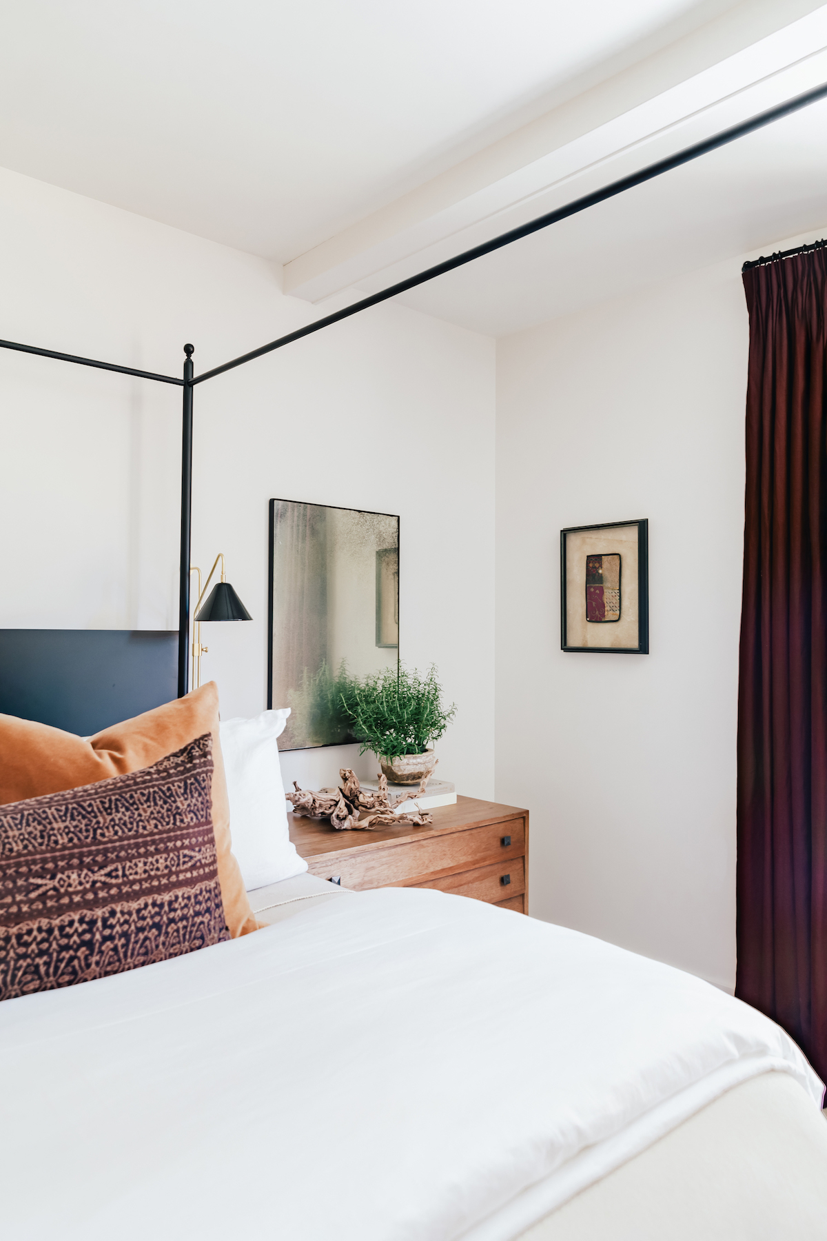
Bedroom Furniture & Other Details
Side Tables: Noir Nietzsche in Dark Walnut
Artwork on bedside table: Anecdote
Bedside Light Fixtures: Katy Skelton Home
Mirrors: Clooney antiques mirrors
Rug: West Elm Sweater Rug
Long Sideboard: Noir York Sideboard
Drapes & Drapery Rod: custom but similar drapery rod found here
The Bathroom
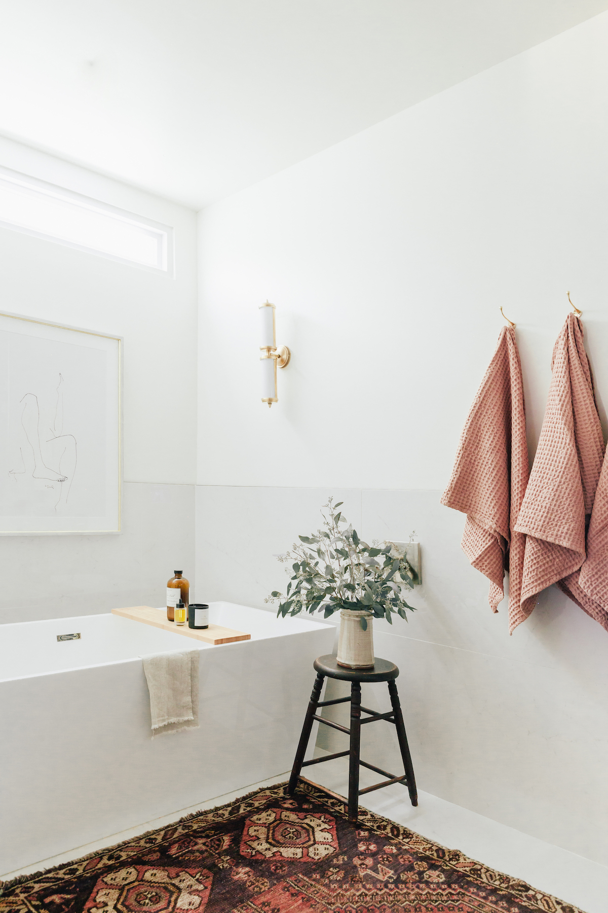
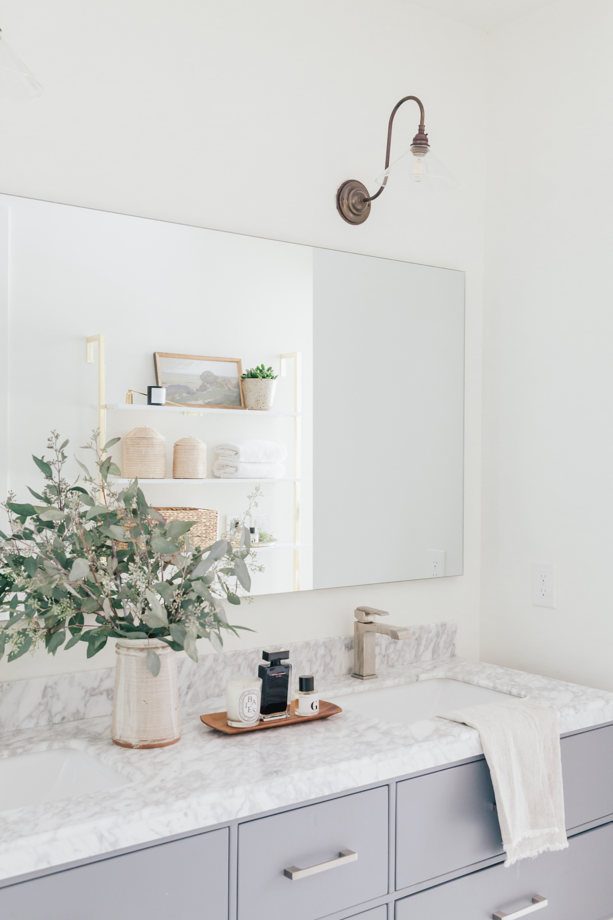
The bathroom is lovely, but there’s no window in here so we did a lot to add light in here! I added more canned lights and swapped the light fixtures that the builder (or guy who flipped the home) selected. But most everything else was there when we moved in!
I think the only thing I can link in this image are the white lacquer shelves shown in the mirror reflection! They’re great!

